Top Tips On Correct Logo Placement – A Branding Guide

A logo is an essential element of your brand identity. It represents your brand and everything it stands for on all your marketing materials and channels. Hence, it is necessary to design and place it such that it leaves a lasting impression on the viewers and your customers. Most businesses focus only on the design of their logos, giving little thought to how and where it is placed on their promotional materials and digital channels to make the right impact. Although it seems like a minor detail, logo placement has a significant impact on the way a brand is perceived and trusted. From making a great first impression and enhancing brand recognition to representing brand values, the correct logo placement can help you achieve many vital marketing goals. Here are our top tips for promotional products and digital channels to help you get it right.
Promotional Clothing
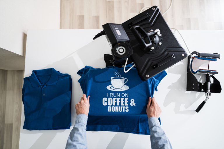
Branded apparel is one of the most popular promotional items that works for all businesses. Whether it is uniform for employees or promotional gifts for loyal and potential customers, branded clothing is commonly used by businesses to increase brand awareness and trust. Regardless of the type, all promotional apparel has a logo which can advertise the business every time someone wears it.
Due to the large surface area on most promo clothing items, you have the opportunity to be creative and smart about your logo placement. The good news is, you can place your logo anywhere in the front centre, on the left, at the back, or on the sleeve, and it will help successfully promote your brand. You also have the freedom to play around with the design elements by including just the graphic logo on some while also including the business name on others. No matter how you wish to print your logo, just ensure that it is:
- Bold and visible from different angles
- In proportion to the product dimensions
- Consistent with the rest of the branding
- Not too large and in-your-face
Digital Channels
Unlike physical promotional products, logo placement on digital channels like websites and email newsletters needs to follow some rules to make the desirable impact. According to research conducted by the Nielsen Norman Group, users are 89% more likely to remember logos shown in the traditional top-left position than logos placed on the right. You can still place your logo in the top centre or top right corner if you aim to stand out from the crowd and set your brand apart from the competitors.
Although it is not carved in stone, placing your logo on the top left corner is more likely to immediately grab the attention of the visitors and make the logo instantly memorable. It also helps visitors better navigate and find pages and sections on your website, which may otherwise be affected if the logo is ill-placed and in the way. Another important thing to remember when placing your logo on your website or newsletter is to keep it scalable so that it appears sharp and beautiful no matter which device it is viewed on.
The best way to ensure that you get your logo design and placement right is to work with branding experts like Big Bear Promo. Our logo designers can help design the best logo for your brand and print it in the right place on your desired promotional item to get the visibility and attention it deserves.
Call us on 0116 326 0950 or email us your requirements at [email protected] today!